🏅 wp99.in has been continuously providing regular updates to the customers since 2016 to 2025 🏅
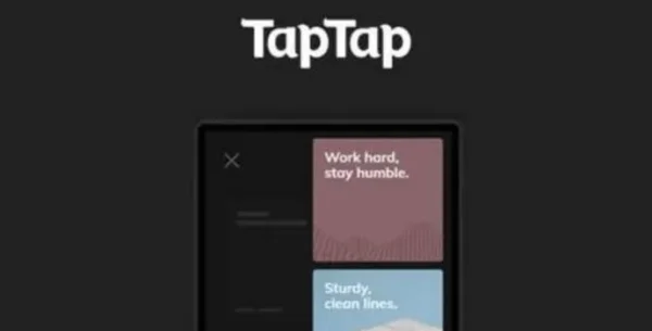
TapTap: A Super Customizable WordPress Mobile Menu
Download Files
₹99.00 – ₹399.00Price range: ₹99.00 through ₹399.00 + GST TAX
Verified from VirusTotal
Free Lifetime / One Year Update.
100% Original Product and Virus Free.
100% Untouched and Unmodified Files.
Unlimited Website Usage

With TapTap, we set out to create an easy-to-customize, mobile-first, off-canvas menu plugin for WordPress that would be versatile enough to be used on literally any site.
Be it a creative’s portfolio or a corporate site, mixing and matching fonts, font sizes, icons, letter spacing, colors, button and logo positions, backgrounds, alignments, animation speeds etc. allow you to quickly create a menu that’s uniquely yours. Forget pre-determined layouts and build the mobile menu you want. Preview any changes you make in real-time and customize your new menu faster and easier than ever.
To get the full lowdown on TapTap, please have a read at the features list below and do have a look at the live examples on the demo site here.
PS! TapTap is available at a discount in the WordPress Mobile Menu Bundle.
TapTap full features list:
TapTap is wildly customizable and by far the most versatile WordPress mobile menu available anywhere. To get acquainted with everything you can edit, add and customize, please have a look at the full details on TapTap’s near-endless possibilities below.
Menu Button
- Position menu button left or right, then fine-tune top/side distance with per-pixel accuracy
- Open menu by click/tap or by mouseover
- 6 different menu button styles
- Each style has regular and thin variations (12 designs total)
- Each button has two different animations (or no animation at all)
- Set custom animation speed
- Set button opacity
- Customize color, hover color (+ colors when menu active)
- Add label to menu button
- Enter custom label text
- Position label anywhere around the button with per-pixel accuracy
- Set custom font size
- Set custom letter spacing
- Select label font (12 options available, or use a theme font)
- If menu button is hidden, label will remain visible (if one is entered) and can be used to activate the menu
- Customize label color, hover color
- Optionally hide menu button (useful if you’d like to use a custom element to activate the menu)
Logo Placement
- Position logo left, center or right, then fine-tune top/side distance with per-pixel accuracy
- If logo entered as text:
- Set custom font size
- Set custom letter spacing
- Select logo font (12 options available, or use a theme font)
- Customize color, hover color
- If logo entered as an image:
- Set custom logo image size
- Optionally hide logo placement
WooCommerce Cart Button
- Position WooCommerce button left or right, then fine-tune top/side distance with per-pixel accuracy
- Cart and shopping bag icon variations
- Customize colors, hover color
Search Button
- Position search button left or right, then fine-tune top/side distance with per-pixel accuracy
- Regular and thin search button variations
- Optionally flip search button for additional variations
- Customize color, hover color
- Add label to search button
- Enter custom label text
- Position label anywhere around the button with per-pixel accuracy
- Set custom font size
- Set custom letter spacing
- Select label font (12 options available, or use a theme font)
- If search button is hidden, label will remain visible (if one is entered) and can be used to activate the search function
- Customize label color, hover color
- Optionally hide search button (and the function along with it)
Search Function
- Set custom appearance animation speed
- Seach field:
- Set custom searchfield placeholder text
- Customize search field height
- For RTL support, align searchfield text to the right
- Hide ‘clear field’ option
- Set custom font size
- Set custom letter spacing
- Select label font (12 options available, or use a theme font)
- Change search field background opacity
- Customize colors of search field background, placeholder and search text, close and ‘clear field’ buttons
- Set background overlay opacity and color
Header
- Show/hide header
- Set custom header height
- Change header background color
- Change header background opacity
- Show/hide header background shadow (+ set shadow strength)
Menu Container, Menu, Widgets etc.
- General:
- Display menu fly-out as full-screen or set custom width/height
- Height is applicable when menu is set to animate from top/bottom.
- Width is applicable when menu is set to animate from left/right.
- Set menu to appear by fading in or sliding from left, right, top or bottom
- Set custom menu appearance speed
- Optionally show submenu when current (have menus open when on current menu item)
- Optionally close menu after clicking on menu item (useful on one-page websites)
- Align menu contents left/center/right and top/middle/bottom
- Give content inside the menu container maximum width
- Alter menu contents’ scaling animation (any scaling level, positive or negative, or disable altogether).
- Set custom left, right, top and bottom padding menu container
- If on desktop, pressing the ESC button closes the menu and search
- Change menu background overlay color and opacity
- Display menu fly-out as full-screen or set custom width/height
- Background:
- Add background image or pattern
- Control corner roundness and distance from screen edges
- Change background image positioning
- Change background image opacity
- Change background color
- Change background color opacity
- Create animated, pulsating or gradient color backgrounds (+ change animation speed)
- Add heading, subheading texts:
- Change fonts (12 options available, or use a theme font)
- Change font sizes
- Change letter spacings
- Change line heights
- Turn heading texts into links
- Add heading image:
- Set maximum size
- Turn heading image into a link
- Set top and bottom margins
- Accordion menu:
- Build a multi-level menu (no depth limit)
- Add descriptions to single-level menu items
- Set vertical spacing between menu items and menu descriptions
- Change fonts (12 options available, or use a theme font)
- Change font sizes
- Change letter spacings
- Change line heights
- Change all colors
- All font options can be set individually for top-level and sublevel items as well as menu descriptions
- Add icons to menu items:
- 600+ icons available
- Change icon size (separately for top-level and submenu items)
- Change icon color (separately for top-level and submenu items)
- Customizable styled scrollbar:
- Customize scrollbar colors
- Customize scrollbar thickness
- Customize scrollbar distance from the sides
- Customize scrollbar corner roundness
- Show the scrollbar always or only on mouseover
- If styled scrollbar is enabled, it will be displayed on desktop only. On mobile, the device’s native scroll behavior is used.
- Content animation effects (applied to selected content when menu opens/closes):
- Scaling
- Opacity
- Blur
- Widget locations:
- Widget locations above as well as below the menu
- Text widget accepts shortcodes
- Select fonts (12 options available, or use a theme font)
- Set custom font sizes
- Set custom letter spacing
- Set custom line heights
- Change colors (titles, content, links)
- Set font settings individually for widget titles and content
Misc
- Show/hide at specified resolutions (show on mobile and hide on desktop, or vice versa)
- Hide completely on specified posts/pages
- ‘Smart header’ option (header elements slide out of view when site scrolled down, slide back into view when scrolled up).
- Hide theme menu, logo etc. when TapTap is active, by the class/ID of the theme elements
- Optionally lock body scroll when menu opened
- A dozen carefully selected font variations included (or use your theme fonts)
- Open submenus from arrow indicator or full top-level menu item
- Optionally have TapTap open by default on the front page
- Toggle the menu via a custom element, via an activator class
- Display alternate close menu button. Available options include left/right positioning and position fine-tuning, fixed or absolute positioning, an optional hover animation, color and thickness settings.
- RTL support
- WordPress multisite compatible
- Absolute/fixed positioning
- Have the logo, search and header appear above or below menu
- Optionally don’t load FontAwesome icon set (useful if you don’t use icons in your menu or if something in your installation already loads this widely used icon set)
- Optionally disable retina support (in case you don’t make use of the image possibilities in the plugin)
Experimental Image-based Menu
Please note: When made use of, the image-based menu layout can be used both instead of and in addition to the main menu. The image-based menu has its own set of settings that do not apply to the main menu and vice versa.
- Change all colors
- Change corner roundness
- Supports up to nine top-level items and unlimited submenus
- Upload main images and change other settings in the “Image-based Menu” section
Be the first to review “TapTap: A Super Customizable WordPress Mobile Menu” Cancel reply
You must be logged in to post a review.
- Login withGoogle









Reviews
There are no reviews yet.